

PROJECT BRIEF
Our team was brought in to re-brand the Nature Sounds record label identity. We were asked to bring a modern execution to their existing logo, which they felt was dated. We went through an extensive design process; icon development, type selection, color application and brand guidelines. Our process began with logo ideation. The selected iterations were then organized into categories from which our client chose selects. We then refined those concepts until we had a final selection that we built out into a comprehensive identity.
DESIGN TEAM
creative direction: Dino Manuel
art director: Michael Cena
designer: Stephen Paff
designer: Michael Jorgensen
NATURE SOUNDS TEAM
founder/CEO: Devin Horwitz

WORD-MARK DARK
WORD-MARK LIGHT
FAVICON DARK
FAVICON LIGHT
COLOR PALETTE


TYPOGRAPHY – OSWALD SANS
Oswald provides a rigid, simple font, that is good for both web & print communication.

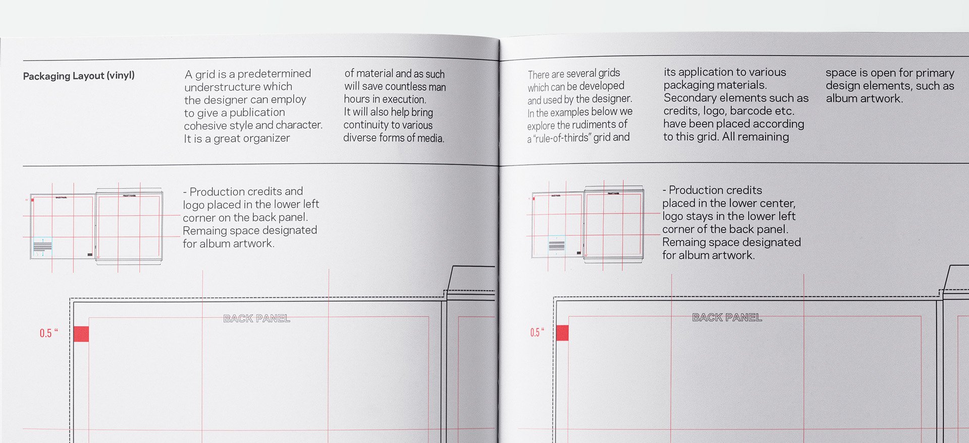

PROCESS
SELECTION REFINEMENT
V.1
V.2
V.3
V.4 (FINAL)
